


You know when that guy you’re dating says that he’ll change, only for you to realize that he just meant he’d change the ways he’d piss you off? Well, seems like Facebook is making a similar F*ckboi Move after their rebrand to… wait for it, FACEBOOK. No, I’m not screaming its name, it’s just all in capital letters now.
Him: I’ve changed
Also him: https://t.co/OoMaN9st5S— Betches (@betchesluvthis) November 4, 2019
It would seem the company has decided to give themselves this face-lift because of all the negative press it’s been receiving since, you know, ruining an election. The fact that Mark Zuckerberg is standing firm in his conviction that politicians should be able to purchase the right to lie to voters (aka allow lies in political ads) also likely prompted the change.
Perhaps because of the toxicity associated with “Facebook,” the name change seems designed to differentiate Facebook the platform from Facebook the company — a company that’s already made up of smaller parts (Instagram, What’sApp) — and signal to candidates threatening to break it up that it is, already, broken up.
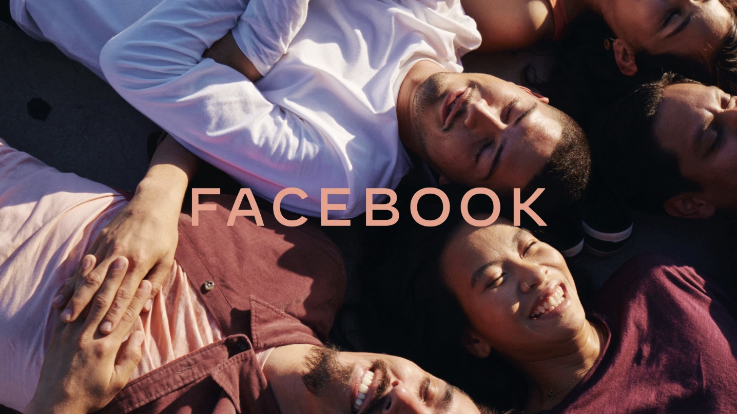
The company stated in a press release yesterday: “Facebook started as a single app. Now, 15 years later, we offer a suite of products that help people connect to their friends and family, find communities and grow businesses… The new branding was designed for clarity, and uses custom typography and capitalization to create a visual distinction between the company and app.”
A visual distinction between the platform undermining democracy across the globe and a place where you can save vegan recipes and fire memes. Got it.
It’s funny they chose FACEBOOK as the new name, because nothing relaxes me more than a site that is SCREAMING AT ME while showing all the free-flowing thoughts of racist people I went to high school with. This is sort of like when Taylor Swift realized nobody really liked her snake vibe, so she went back to rainbows with Lover. Except she didn’t influence an election, she just didn’t speak up about politics existing until becoming friends with Todrick Hall or something.
Another funny similarity between the two? They both went for fun, rainbow-y colors for their new logos — cannot wait for Zuck to tell me that shade never made anybody less gay. They’re using these colors because they’re apparently part of an “empathetic color palette.” For real guys, Facebook has totally changed now. Additionally, they feel that the logo’s “subtle softening of corners and diagonals adds a sense of optimism,” which I guess is fair because if I pulled the sh*t they have, I would probably panic and dye my hair blonde.
Also, is it just me or are they just completely using the colors from Instagram, which if you didn’t know is owned by Facebook. I guess the best thing for Facebook to do in 2020 is just ads answering the age old question “So, a lot of you guys have been asking about my skincare…” instead of “HILLARY CLINTON HAS 10 EYES.”
Not only are they borrowing Instagram’s color aesthetic, but they’re also doubling down on the fact that yes, Facebook owns Instagram and also WhatsApp. Screenshots from these apps after the update show that they now have FACEBOOK’s logo appear in various areas, giving me very big ‘Marc by Marc Jacobs for Marc Jacobs’ energy. This is most likely to give the parent brand a PR facelift – cause while everyone is hating on Facebook (Sorry, FACEBOOK), we’re all still obsessed with Instagram and WhatsApp.
I’m curious to see if any actual change comes from this move — best case, they make FACEBOOK a place where everyone can eat cake and love each other, but worst case, they just remind us in November 2020: “Yeah, we suck, but the avocado toast you just posted looks amazing on your grid.”
Image courtesy of FACEBOOK